
| Admittedly the last logo rendition I did for 2013 was a bit rushed. As a result It lacked structure and thought. Today I am launching a much stronger version that pay homage to my original mark attempts back in 2006 and the 2013 fractal styling I love today.
Z•A•Martz focuses on 3 core concepts :
Technical Structure, Design Esthetics, Business Objectives!
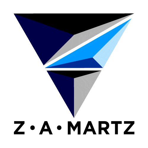
Each Portion of the the Z•A•Martz logo represents one of the three facets on my approach. The logo is composed of three colors plus white.
I went back to the downward pointing logo with the understanding in this digital age content is explored by going downward instead of side to side. Thus the logo directs you to the content.
The “Z•A•MARTZ” Text also directs attention down and the bottom point of the mark can fit into the valley of the “M” (also points downward).
The fractal pattern I created evokes the logo esthetic but allows for a very unique repeating pattern that forms irregular shapes between each a joining fractal square.