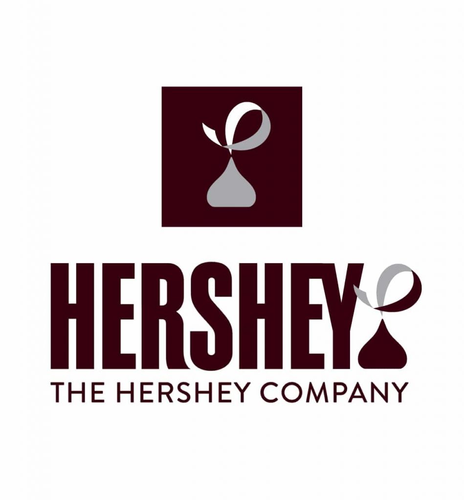
I agree with most that the kiss mark at the end of the HERSHEY name looks like a certain stinky emoji… however as a while the new design system is pretty solid. I believe that there is just a tiny tweak to the current Hershey Logo that can be done with the kiss and solve the whole issue.
I went ahead and created my own quick solution for the kiss, plus a EY ligature. My whole goal was to change what was created the least amount and fix the problem at hand.
Websafe Colors Chocolate #300 & Silver #999
There was a contest held at 99Designs … but they are all… less than exciting. Go see for yourself <a href=”https://99designs.com/logo-design/contests/designs-community-contest-reimagine-hershey-logo-413547″ target=”_blank”>REDESIGN CONTEST</a>
