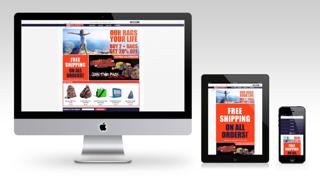
Recreate the existing Cockpit USA theme, update the layout to clear clutter and format to fit responsive structure. Develop Responsive structure for Desktop,Tablet, and Mobile devices. [ FULL PROJECT INFO ]
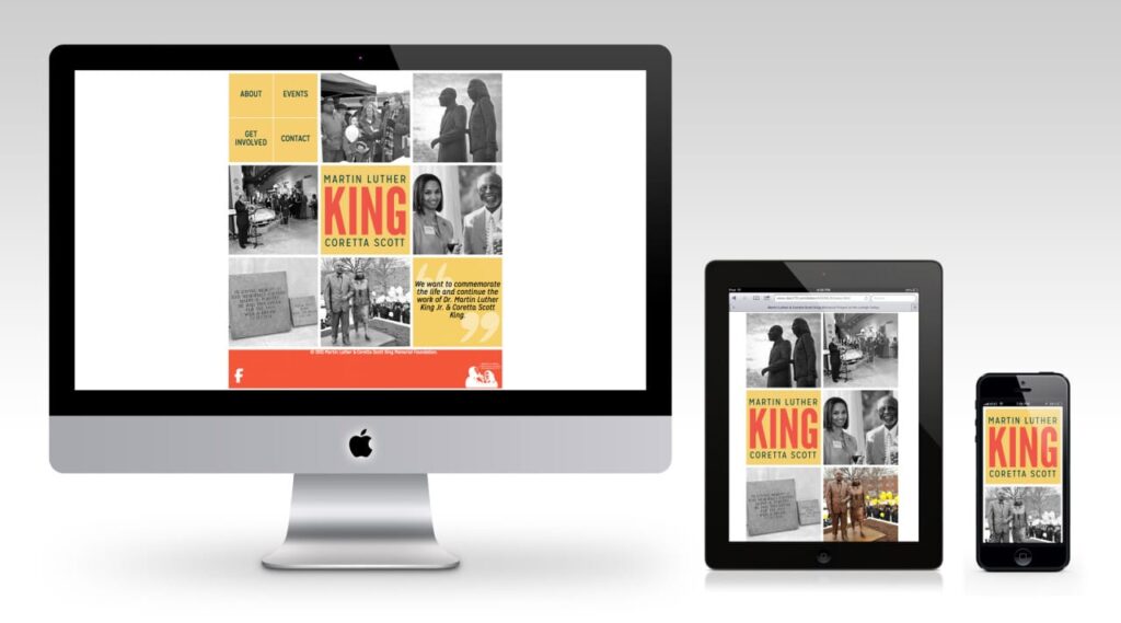
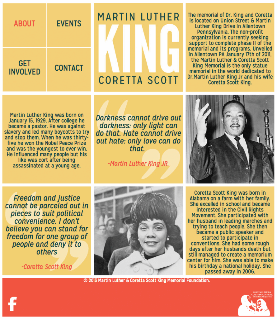
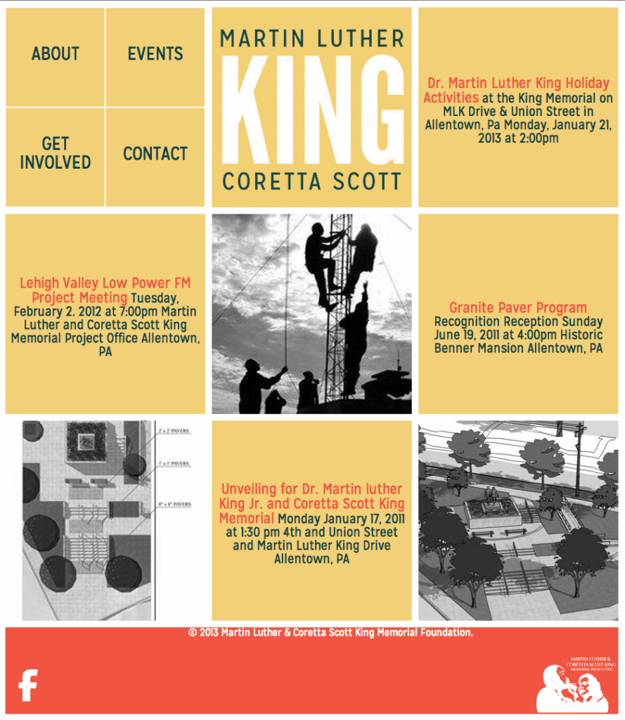
Martin Luther & Coretta Scott King Memorial Project
DESIGNATHON: 24-hour event where teams of volunteer Communication Design students along with professors and alumni, design and produce pro-bono creative works for non-profits.
ORGANIZATION MISSION:
[WEBSITE] To commemorate the life and continue the work of Dr. Martin Luther King Jr. & Coretta Scott King, by developing a memorial, programs and initiatives to honor the King Family and address issues of civil rights, world peace and economic equity for all.
DESIGN: Simple flat layout design with shallow color pallet and hover-color black & white imagery. • 100% Responsive design – Breakpoints at 900/600/300 widths • CSS3 compound stylesheet structure • Lightweight CMS (Pagelime) editng classes. • Addaptive jQuery paragraph centering code • Interactive Google Maps of live site • Email Subscription and Domation forms
STUDENT DESIGNERS: • Jessica Savard (Senior – team leader) • Kirsten Detweiler • Sydney Schollenberger (Alumni Mentor – Zachary A. Martz “ME”)