Project
Hershery Chocolate Logo Redesign Concept
Asset Pack
New Logo and Mark
I agree with most, that the kiss mark at the end of the HERSHEY name looks like a certain stinky emoji… however, while the new design system is pretty solid…. I believe that there is just a tiny tweak to the current Hershey Logo that can be done with the kiss and solve the whole issue…

ZAMARTZ
Hershey Web-safe Colors

Color Kiss Chocolate #300

Color Kiss Silver #999
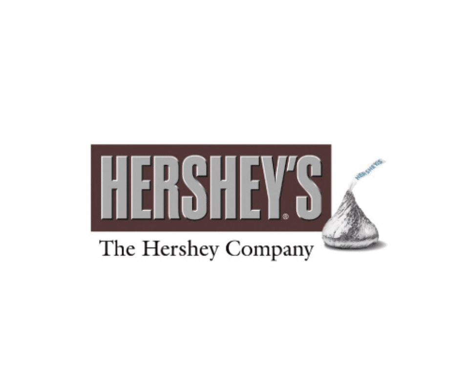
ORIGINAL
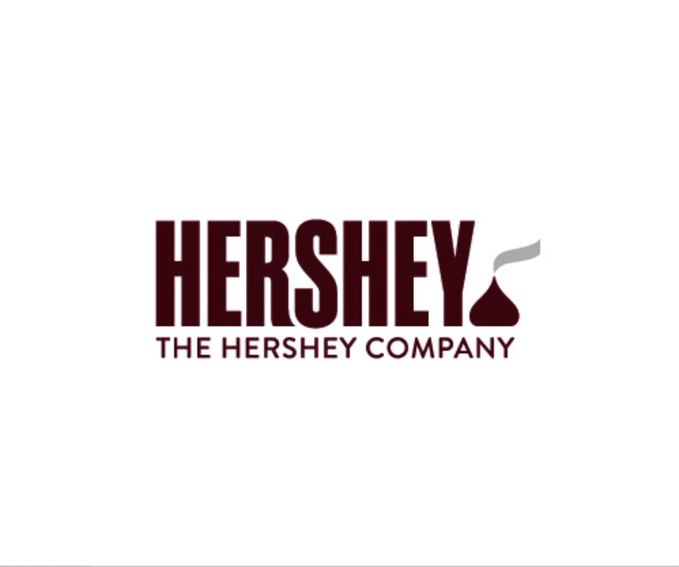
Hershey’s Redesign
Before and After of what Hershey originally launched with in 2014. Being a PA native (Hershy’s home state) I just felt like this was the final nail in the poor branding decisions. Following the removal of the tin foil on chocolate bars, this was just another out of touch decision with consumers nostalgia.
Contact
Get In Touch
Please feel free to reach out! I am open to discuss collaborations, speaking engagements, work with Google Marketing Technology, training sessions for project management, and more...


