Project
BASIC Apparel Brand ConCept
BASIC Apparel was a deliberately stripped-down fashion brand and e-commerce concept created as a tongue-in-cheek response to the hyper-sexualized, high-gloss fashion campaigns dominating the late 2000s. Inspired by brands like Calvin Klein and American Apparel, the project leaned into everyday sameness—selling just enough sex and danger to feel familiar, uncomfortable, and intentionally unremarkable.
The goal wasn’t luxury. It was reduction.


BRAND
Identity & Logo Concept
The BASIC logo was designed to feel almost utilitarian—referencing the most basic apparel hardware that still performs a critical function: a zipper pull.
- Simple
- Industrial
- Uncelebrated
- Essential
The mark avoided trend-driven typography in favor of something that felt mass-produced and emotionally neutral—aligning with the brand’s anti-aspirational stance.
campaign
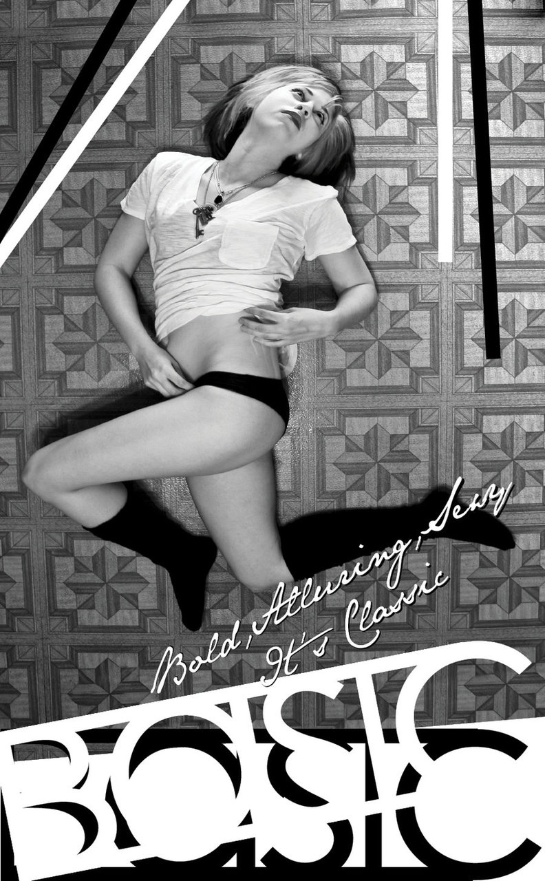
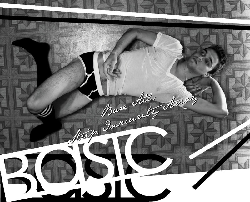
JUST A BASIC AD
The campaign was shot with real constraints and embraced them fully:
- Models were fellow students
- Apparel was primarily American Apparel basics
- Identical socks and tops were reused across shoots
- Photography took place on my grandparents’ dining room floor after clearing out all furniture
Instead of hiding these limitations, the work leaned into repetition. The sameness became the statement. The floor pattern acted as a visual anchor—almost oppressive in its consistency—while bodies collapsed, twisted, and disrupted it.
The poses were intentionally awkward, selling a subtle sense of danger without tipping into shock value.
Digital
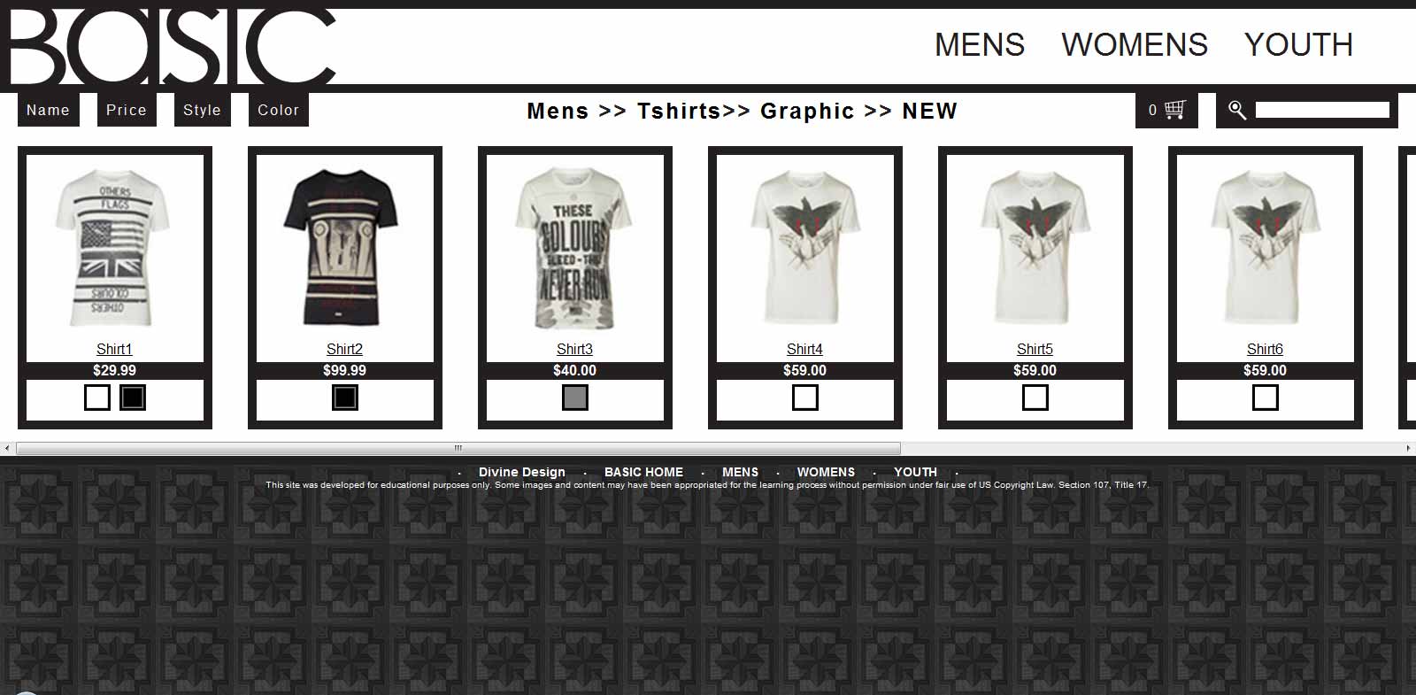
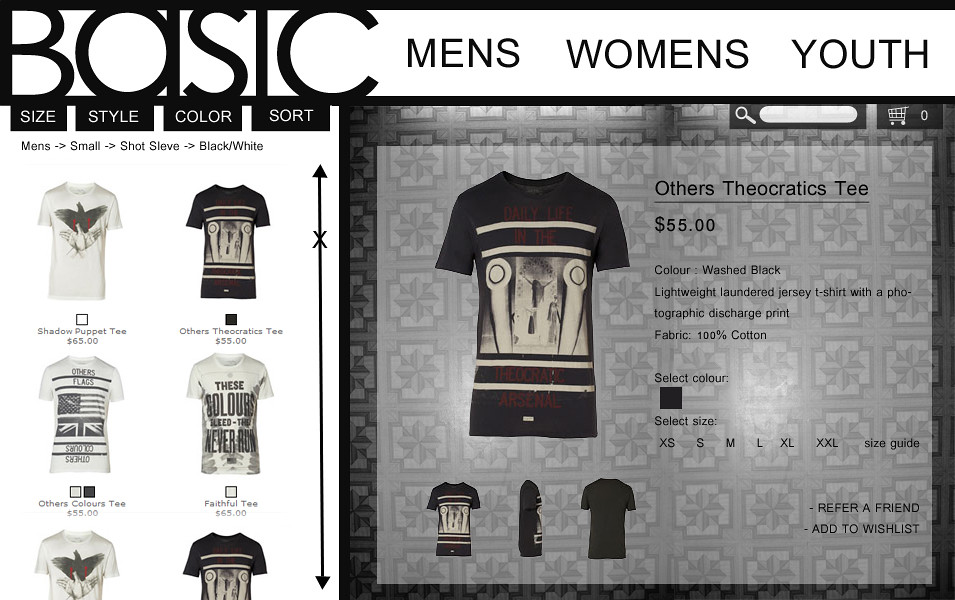
Design system and mobile layout
The website experience was aggressively minimal:
- Black outlines
- Black text
- White backgrounds
- Monochrome product photography
- Simple color swatches
No gradients. No flourish. No unnecessary UI.
The entire product catalog was driven from a single Excel .csv file, which dynamically populated the site—intentionally using a tool associated with inventory and logistics rather than fashion. The catalog structure became part of the concept: clothing treated like data.
This decision reinforced the brand’s philosophy:
Apparel as commodity, not aspiration.