Project
Hershery Chocolate Logo Redesign Concept
Hershey’s is a Pennsylvania native and lifelong design enthusiast, I revisited the 2014 Hershey logo redesign — refining the “kiss” mark that many found questionable while preserving the strength of the brand’s updated system. This concept explores a subtle but impactful logo tweak that restores the nostalgic warmth and authenticity behind one of America’s most iconic chocolate brands.

Asset Pack
New Logo & Mark
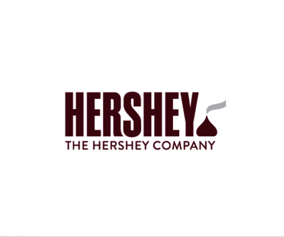
I agree with most, that the kiss mark at the end of the HERSHEY name looks like a certain stinky emoji… however, while the new design system is pretty solid…. I believe that there is just a tiny tweak to the current Hershey Logo that can be done with the kiss and solve the whole issue…
Digital
Hershey Web-safe Colors
With any sort of design, the iteration process is quite intensive. Through out the life cycle of a project design rounds touch multiple stakeholders, designers, producers, and programmers.Very rarely does the first design round make the final cut and when the public/live work arrives it can look vastly different from the original ideation. My revision of the Grey Health Group site borrowed from a previous round and ended up being a bit more light hearted. Final website is still pretty nice but has taken on a darker, more conservative, and corporate health look.
Color Kiss Chocolate #300
Color Wrapper Silver #999

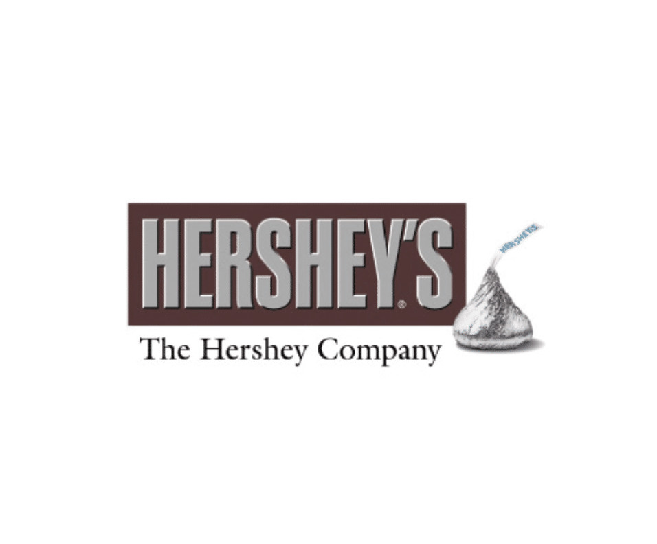
Before 2014

2014 REDESIGN
History
Hershey’s Redesign
Before and After of what Hershey originally launched with in 2014. Being a PA native (Hershey’s home state) I just felt like this was the final nail in the poor branding decisions. Following the removal of the tin foil on chocolate bars, this was just another out of touch decision with consumers nostalgia.
