Project
Saks Fifth Avenue Website Concept
This project explores a conceptual redesign of Saks Fifth Avenue’s online catalog experience, rethinking how editorial storytelling, luxury branding, and e-commerce functionality coexist in a digital environment.
The goal was not to redesign Saks.com wholesale—but to establish a design system and experience standard that modernizes the catalog format while preserving the brand’s editorial authority.

Catalogs
Goal & Concept
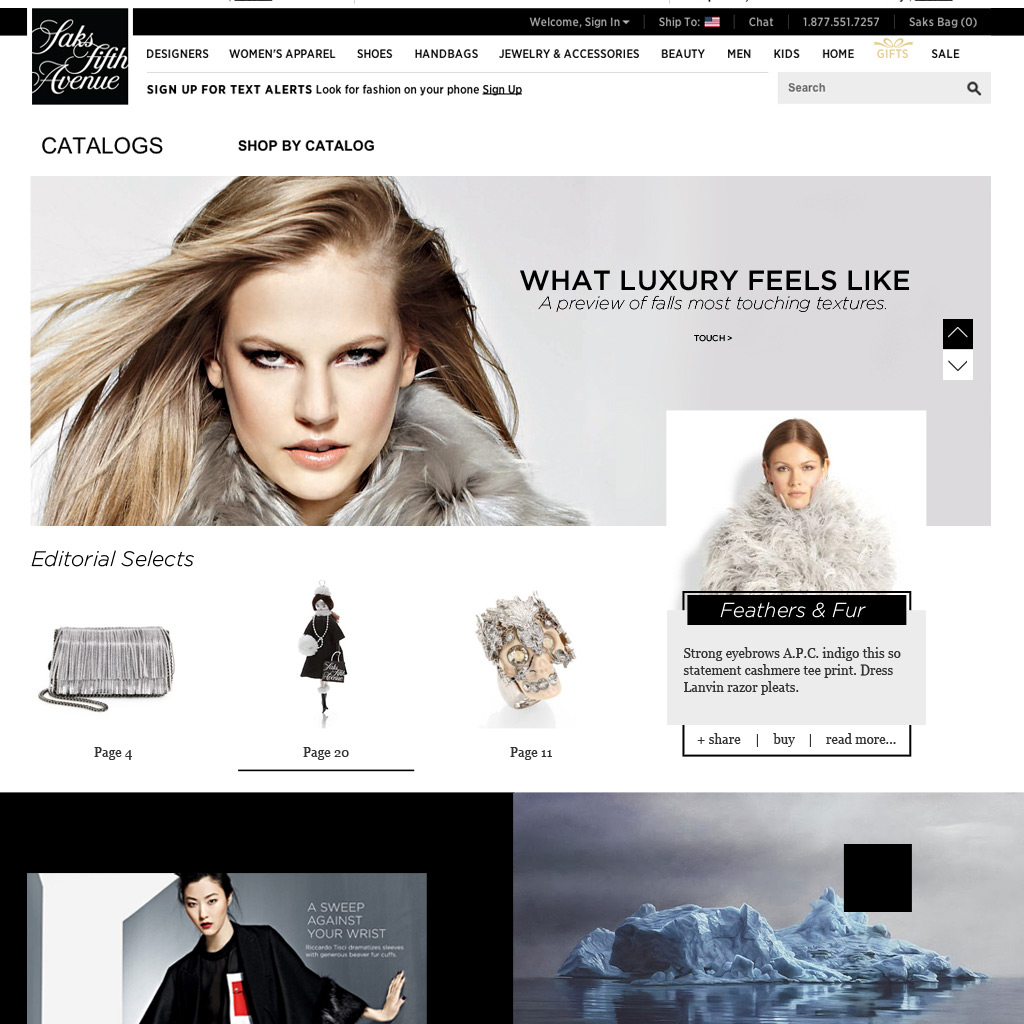
Saks Fifth Avenue’s printed catalogs have long balanced aspiration and commerce. The digital experience, however, historically leaned functional at the expense of narrative.
The core objective was to:
- Translate the luxury and pacing of print catalogs into a digital-first format
- Preserve editorial storytelling while enabling direct product interaction
- Create a system that scales across desktop, tablet, and mobile without losing hierarchy
They wanted content first commece second, I believe that was a miss so I blended the two.
Research
Competors, I.A. & Wireframes
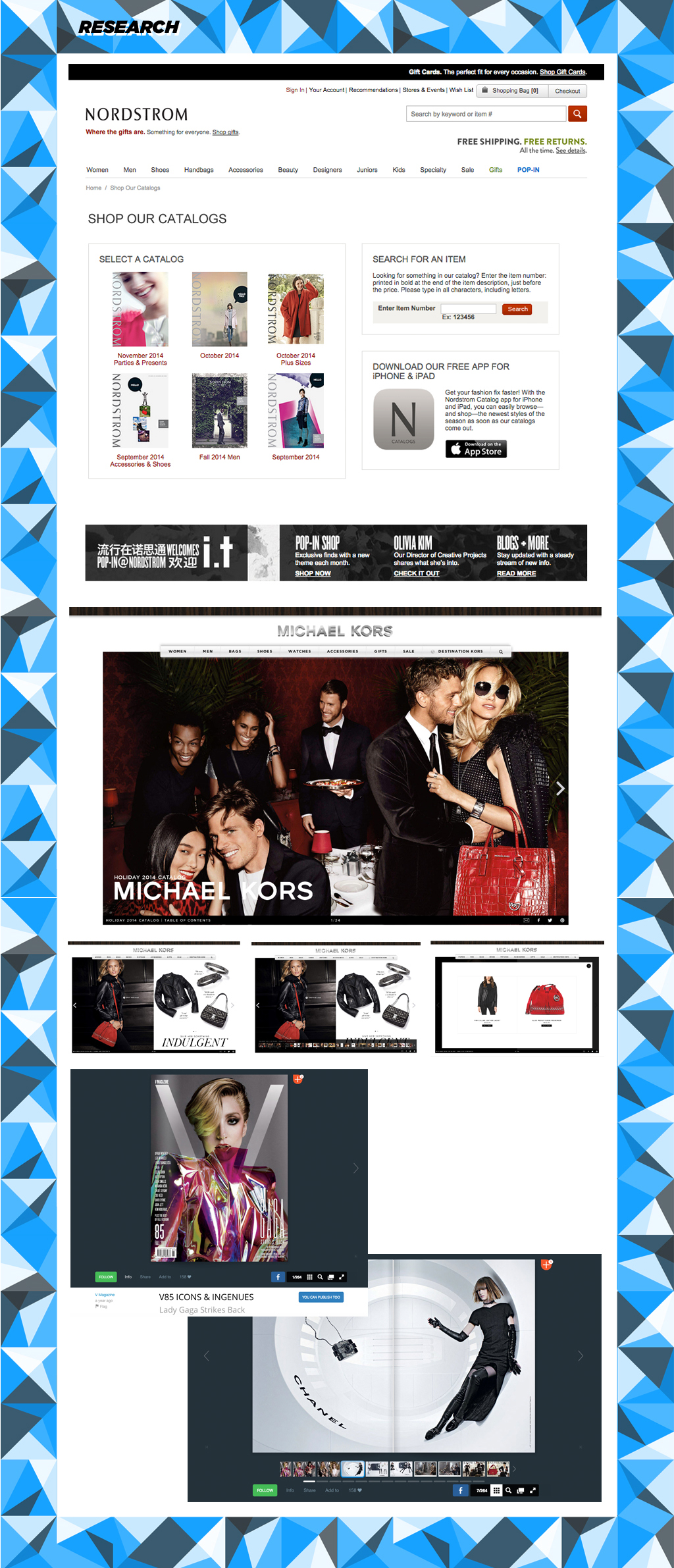
This concept explores a refreshed digital catalog system for Saks Fifth Avenue, informed by competitive research across department stores, luxury fashion brands, and editorial-driven catalog platforms. References included Nordstrom’s catalog navigation and item lookup, Michael Kors’ campaign-led commerce integration, and ISSUU’s page-based digital reading behavior. That research surfaced a consistent gap: most digital catalogs function either as static PDFs with links or as stripped-down product grids, with few experiences successfully bridging editorial storytelling and commerce.
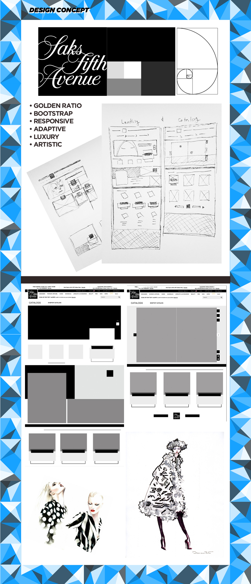
The design system is built on proportion and restraint, drawing structural influence from the Golden Ratio and the Saks square logo. A predominantly grayscale palette allows products and photography to lead, while editorial typography establishes clear hierarchy between narrative content and shoppable elements. Fashion illustration accents—referencing artists such as Antino Soares and Oscar de la Renta—are used sparingly to reinforce an editorial, fashion-forward tone without overwhelming the layout. Overlaying text and imagery creates dynamic hierarchy while maintaining clarity.
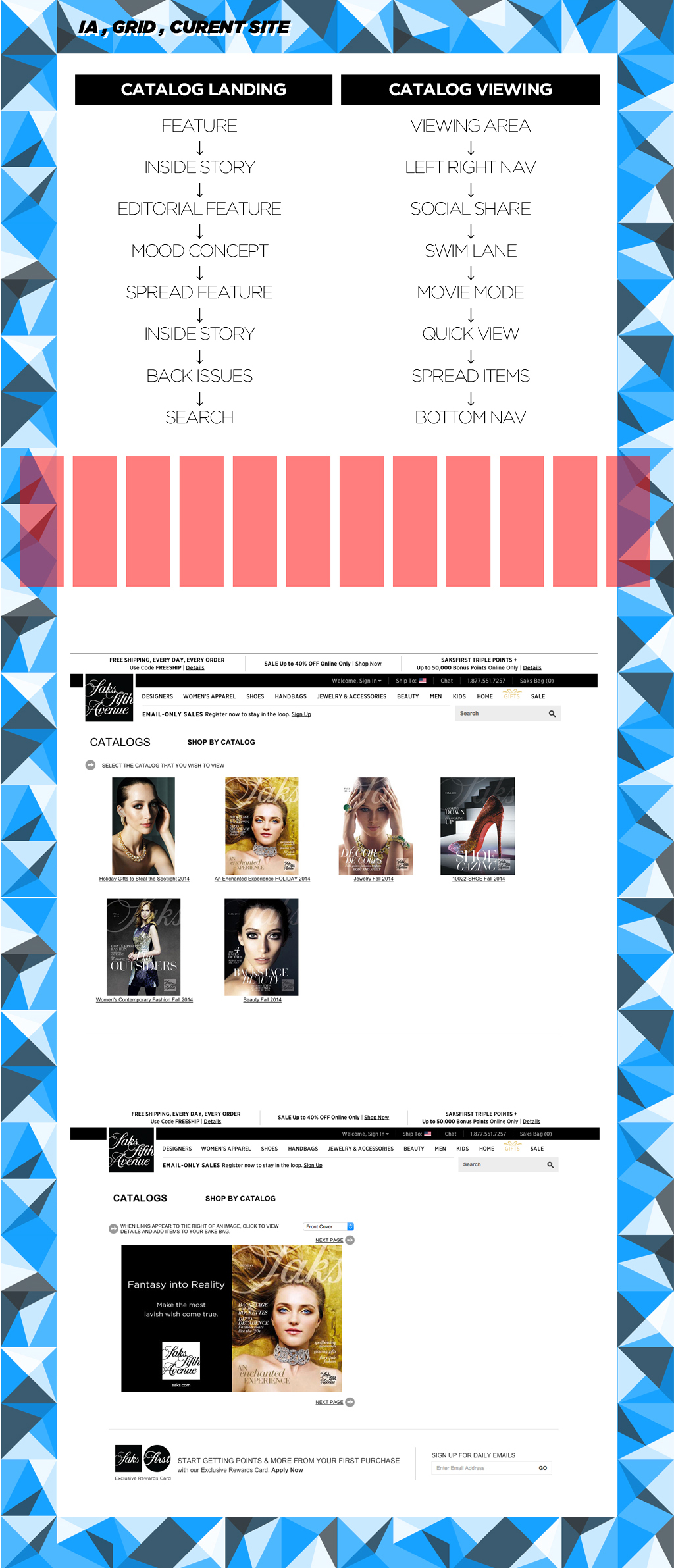
The information architecture simplifies the path from discovery to purchase. The catalog landing experience highlights a featured editorial story, supporting inside stories adapted for web, curated “Editorial Select” products linked directly to catalog spreads, secondary mood-driven stories, and access to past catalogs. The viewing experience centers on full-spread layouts with minimal navigation kept within natural touch and thumb reach. Products are discoverable through inline hotspots and supported by a persistent product list beneath each spread, enabling a seamless transition between immersive editorial browsing and efficient product interaction—especially on mobile.


Grid
Catalog Landing Page
The layout is built on a Bootstrap-based grid designed for flexibility:
- 970px core width
- 12-column system
- 1024px overflow behavior allowing selective full-width imagery
This structure balances control with adaptability, ensuring consistency across catalog spreads, landing pages, and product views.
Editorial and product features are layered directly into the grid:
- Contextual product highlights embedded within spreads, not isolated listings
- Primary catalog stories set narrative pacing across full spreads
- Secondary editorial features introduce seasonal themes and mood


editorial
catalog view with product
The catalog is designed to be experienced like a magazine issue, not a product grid:
- Optional cinema (dark) mode to isolate spreads and remove interface distractions for immersive viewing
- Full-spread, issue-style viewing with narrative pacing across each catalog spread
- Contextual product listings displayed beneath each spread, paired with inline hotspots for Quick View access
- Swim-lane navigation enabling fast movement between spreads without linear page-through