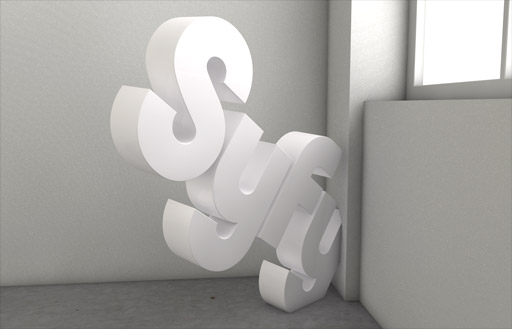
SyFy Re-Identity

SyFy Re-Identity

Proud Creative won a four-way creative pitch in October last year; being appointed lead agency for a full rebrand. The brief asked for an ownable and distinguishable brand identity; retaining the positive associations from the genre of science fiction, whilst appealing to a broader audience and embracing the benefits of imagination.

The channel approached Proud with the name change already a large part of their strategic thinking. Syfy – unlike the generic entertainment category “sci-fi”- establishes a uniquely ownable trademark that is portable across all nonlinear digital platforms and beyond; from Hulu to iTunes. Syfy also creates an umbrella brand name that can extend into new adjacent businesses under the Syfy Ventures banner, including Syfy Games, Syfy Films and Syfy Kids.

 Personally I love the redesign – its more current and somewhat modern for a futuristic channel. Found this a while ago and just didn’t have the time to post…

via(Proud Creative)

:: Photoshop Magnet Kit

These family portraits look ‘shopped

It’s gotten so bad lately that you can look at a magazine cover and immediately say, “airbrushed, lightened, clone-patched…” It seems everybody in print is digitally manipulating their photographs that nobody looks human anymore. Skin is too perfectly smooth, teeth too white, eyes too big, thighs too small, and other parts… enhanced…

via(ThinkGeek)

THANKS ALEX for finding this!

Light Drop – Rafael Morgan

The Light Drop is supposed to make people think about how we are
dealing with our natural resources, in this particular case, the water,
which is the main source of energy for every living organism in this
fantastic world. Water is energy indeed.

This wall-mounted lighting element illuminates the custom-molded polycarbonate bulb with an embedded, dimmable LED in the faucet, which is intuitively controlled by the tap – the more you twist, the more light you get – which also is a good way to contextualize energy use (though at a greatly reduced rate, compared to an incandescent version of the same design.
This design won the Third Prize in the Bright LED international design competition, by design boom.
It´s currently being sold and produced by Wever & Ducre, with the help from my great partners and friends from the fabulous Studio Mango!

via( Behance Network)

Barneby Gates Wallpaper

Quintessentially English with a twist is the best way to describe these gorgeous designs from Barneby Gates. These new kids on the printing block produce beautiful wallpapers that embrace the past with a distinctive contemporary wit. Patterns show typical English influences of country houses, floral decor and heraldry, but on closer inspection have design details that merit a double take

via(Cool Huntings)

Helveticons

Helveticons

Created by Swedish creative Maximilian Larsson, the recently launched Helveticons use the same design principles as the go-to eponymous font for a universal set of interface icons.

Helveticons come in a variety of formats—six of which are scalable vector graphics—including Photoshop, Illustrator, OmniGraffle, EPS, PDF and PNG. Royalty-free and comprehensive, the 245-icon collection serves as a valuable asset for its simplicity and range of essential symbols.

Helveticons are available online for $279, along with a free set of 22 folder icons.

via(CoolHuntings)

Sèvres Vase Clock

The Sèvres Vase Clock, a prototype by Georgios Maridakis, indicates the hour with an audible knock. Just place the vase of your choice on the brass and wood stand and the hammer will strike the vase each hour.

Each vase makes a different sound, but adding different amounts of water for different pitches and notes takes it one step further. The modern take on a grandfather clock is a subtle, unobtrusive way to indicate time—we’d add a few flowers too.

Designer Georgios Maridakis is currently finishing a stint at the Royal College of Art in London. Visit his site for more info on this and other projects.

Via(Sèvres Vase Clock)
–Via(Yanko

The Sky Is Grey : The work of Jonathan Haggard

The Sky Is Grey : The work of Jonathan Haggard

super hilarious you guys.

With all this silly design there needs to be at least one sappy image.

Mike Milosh’s The Sky Is Grey and a heavy dose of pilfering from FFFFOUND.com lent themselves to the creation of something sweet and something somber.

This piece in particular is a cornerstone in my design process and development as an artist – blending illustration, typographical grids and several textures.

An 11×17 inch print can be purchased at the store
http://skryingbreath.deviantart.com

Exit mobile version