
I agree with most that the kiss mark at the end of the HERSHEY name looks like a certain stinky emoji… however as a while the new design system is pretty solid. I believe that there is just a tiny tweak to the current Hershey Logo that can be done with the kiss and solve the whole issue.
Continue reading Hershey Logo ReDesign 2014 ReMixlogo
Z•A•MARTZ Logo 2006 to 2014
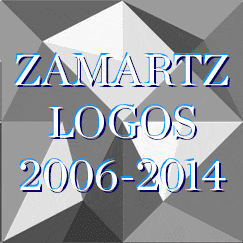
Z•A•MARTZ Logo 2006 to 2014
| I thought it would be interesting to see how my “branding” has evolved over the years. The gif is a little small but it’s a bit hard to track down files going that far back with the type of quality screens demand now-a-days.
Hope you enjoy this little evolution.

Z•A•MARTZ 2014 Logo
| Admittedly the last logo rendition I did for 2013 was a bit rushed. As a result It lacked structure and thought. Today I am launching a much stronger version that pay homage to my original mark attempts back in 2006 and the 2013 fractal styling I love today.
Z•A•Martz focuses on 3 core concepts :
Technical Structure, Design Esthetics, Business Objectives!
Each Portion of the the Z•A•Martz logo represents one of the three facets on my approach. The logo is composed of three colors plus white.
I went back to the downward pointing logo with the understanding in this digital age content is explored by going downward instead of side to side. Thus the logo directs you to the content.
The “Z•A•MARTZ” Text also directs attention down and the bottom point of the mark can fit into the valley of the “M” (also points downward).
The fractal pattern I created evokes the logo esthetic but allows for a very unique repeating pattern that forms irregular shapes between each a joining fractal square.
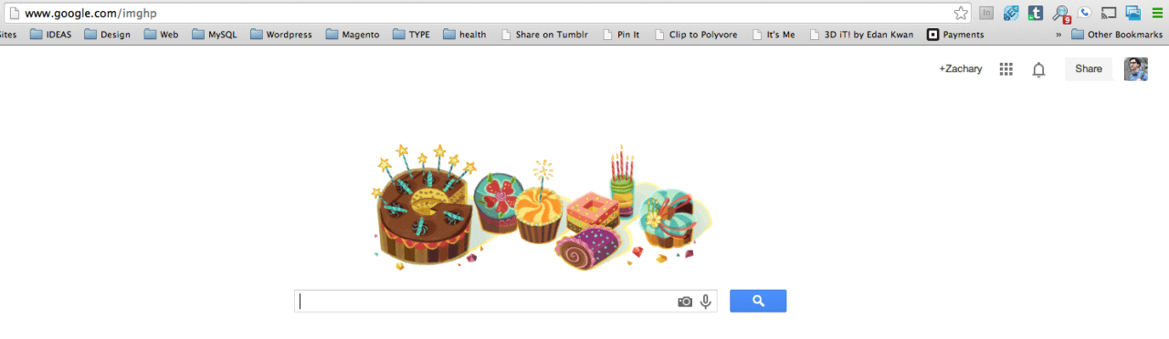
Happy Birthday to ZAMARTZ from Google!
| Very cute/cool feature – if you are logged into google on your bday the googlers show you the “Google” logo in cakes! – Aw google you shouldn’t have 😉
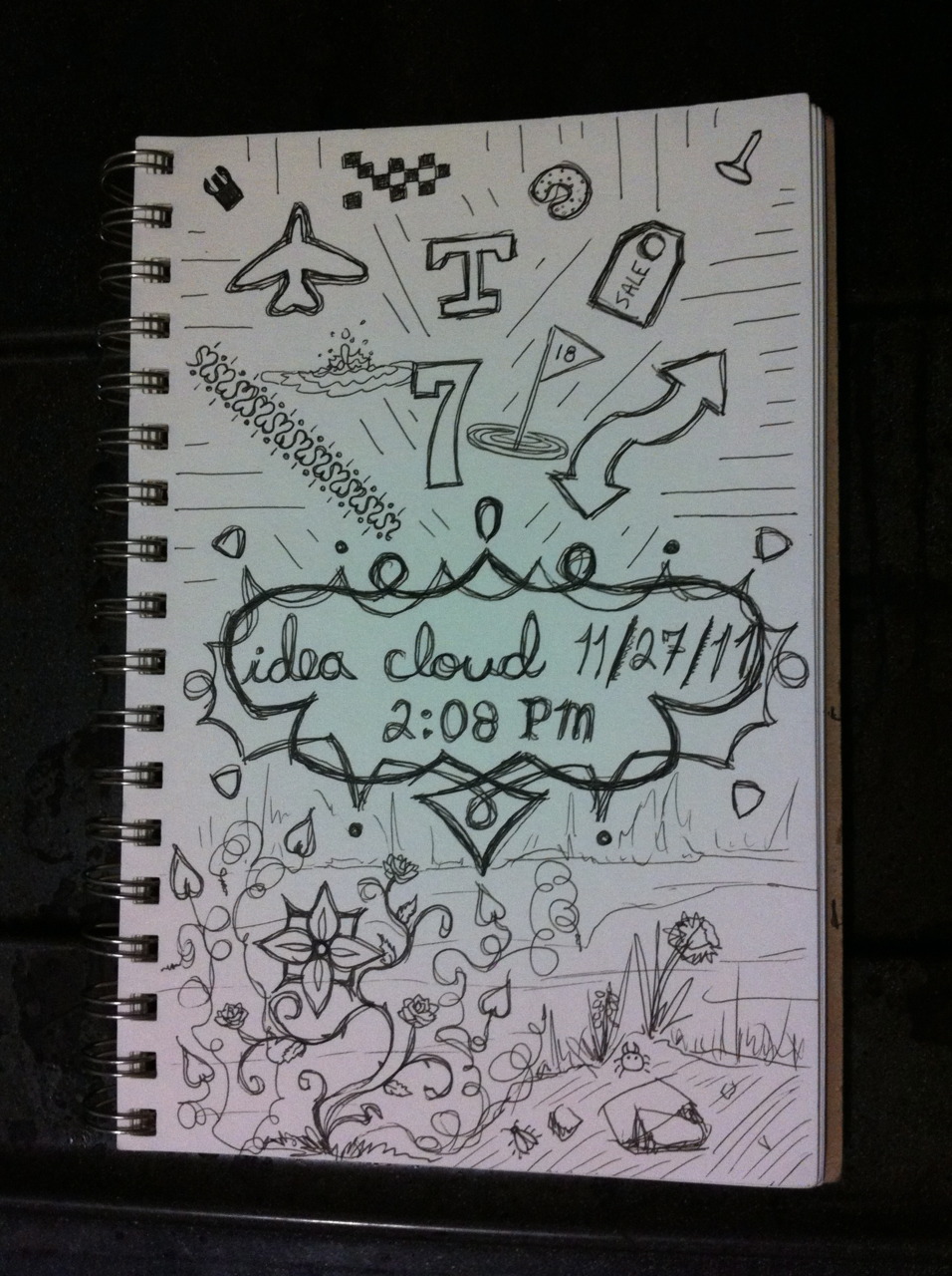
Idea Cloud #10 || 11/27 /2011 || 2:08 PM

Idea Cloud #10 || 11/27 /2011 || 2:08 PM
During a semi-stressful Holiday I managed to get back on track with my Idea Cloud work on the weekend. This is going to be a big week! I start a new job on Tuesday and i’m super excited! Will miss some people at Cockpit but I needed to advance in my career. Fingers crossed for some new and exciting work!
Random Items::
- Seven
- Airplane logo
- Flowers
- Golf
- Bugs
- Arrows
- Water Drop
Follow me “everywhere”!
Follow me “everywhere”!
Follow me for updates on my “brand”
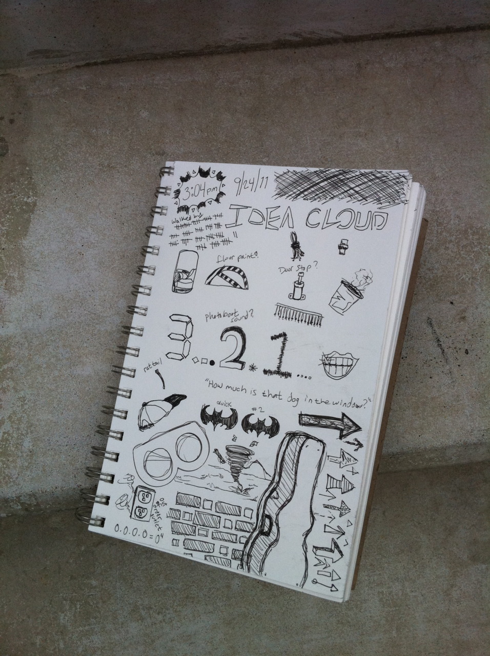
Idea Cloud #2|| 09/24/2011 || 3:04 PM
So far i’ve keep with my plan of a sketch and photo each weekend! I had to sit inside the mini mall today because seating was filled out front of Verb but on the plus side I got to dodge the humidity and watch foreigners try and figure out the photo boot! HAHA – Overall I had some good random thoughts. This beats free-writing in my eyes.
Random Items::
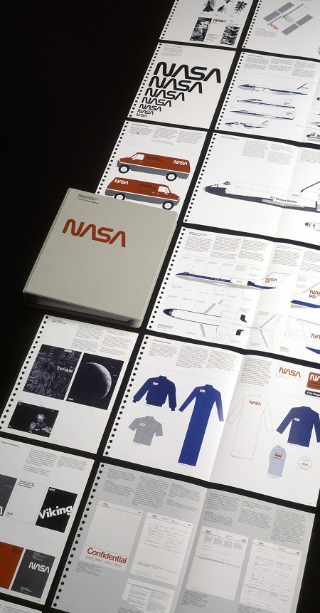
NASA Graphic Standards Manual — 1976
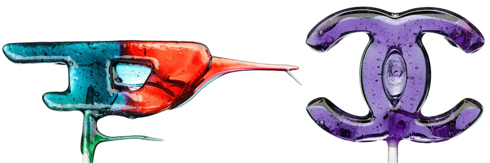
Logo Lollipop

NASA Rebranding by Base Design Exploration
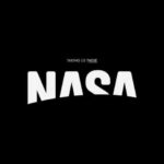
NASA rebrand by Base Design for viewpoint magazine (via jarredbishop). OH GOD – I get WET for a good rebrand, especially fake ones (addicted to the student version of Brand New). This reminds me somewhat of the title design for ‘Up’. Such a simple idea, but so damn beautiful when placed into context.
“THERE” implies that our home is bigger than just Earth—space is no longer there, it’s here. We also like the fact that “THERE” contains the entire journey in a single word
Think i’m gonna start spending the odd weekend doing some more fake redesigns. Which is great, because at 25, hangovers are starting to outweigh the fun you have drinking… BAHAAHAHAHA… could not keep a straight face while I typed that. Oh Jackie Boy… *swirls martini glass*

new EGYPT tourism logo
Heartfelt Connections Through Music
(via gatekeeper)